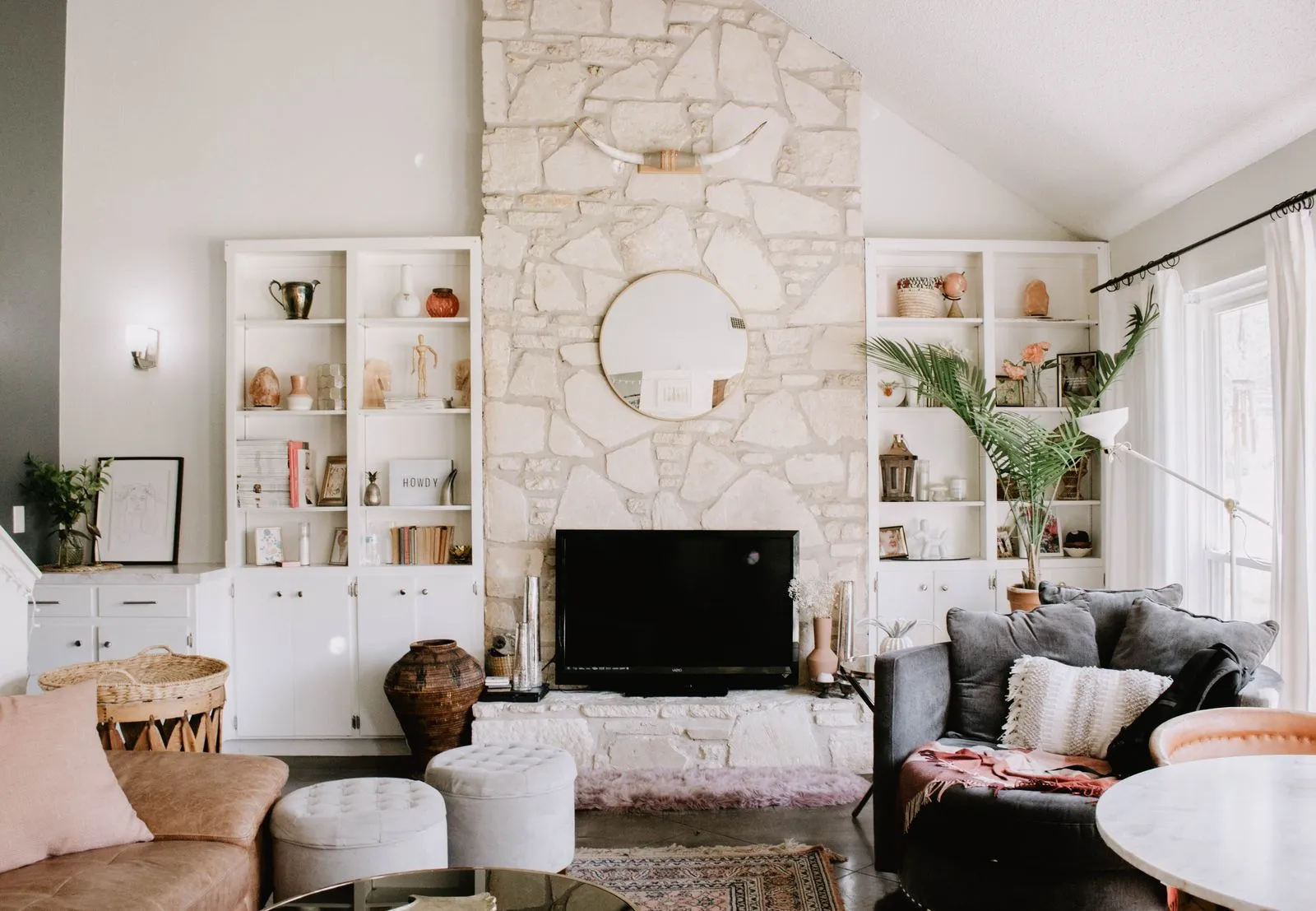
A home’s colors should feel right in each room and make sense together as you move through the house. In Austin, strong daylight can shift how paint and fabrics appear from morning to evening, while tile, wood, and stone finishes may already set the palette’s direction. Start with what cannot easily change, then test colors in your actual rooms. A few deliberate choices can create a home that feels connected without making every space look the same.
Read the Natural Light
Notice how daylight enters each room before selecting paint. North-facing spaces often receive cooler, steadier light, while south-facing rooms can feel brighter and warmer. East-facing rooms change noticeably from morning to afternoon; west-facing rooms may take on a warm glow later in the day. These patterns are starting points, not rules, so observe your own rooms at several times.
Paint large sample boards rather than relying on small chips. Move them between walls and check them in daylight, at night, and beside the room’s flooring and furniture. A color that looks balanced in a bright room may feel heavy in a shaded hallway. Include the trim and ceiling in your assessment, since their color can change how the walls appear.
Start With Existing Finishes
Identify the fixed finishes you plan to keep: flooring, countertops, tile, cabinetry, brick, and large stone surfaces. Note whether each reads warm, cool, or neutral. For example, a floor with golden undertones may sit more comfortably with warm whites and earthy colors than with a crisp blue-white. Look at finishes together in natural light instead of judging each sample on its own.
Let the most prominent finish guide your choices, but avoid matching every element exactly. A useful palette can include contrast: soft wall color beside dark cabinetry, or muted green near warm wood. If a finish has several visible colors, choose one subtle tone from it for walls or accents. This helps the room feel considered without making the pattern or material compete with itself.
Connect Rooms With Color
Choose a small set of colors to repeat across the home. A main wall color, a coordinating neutral, and one or two accent colors can provide continuity while leaving room for variety. Repeat a color in different ways: use it on walls in one room, upholstery in another, and artwork or accessories elsewhere. The connection will feel natural even when each room has its own character.
Pay special attention to sightlines between adjoining rooms. If a living room opens to a kitchen or hallway, view the proposed colors together from the doorway. Consider whether the tones and intensity work as a group. You do not need identical wall colors throughout, but abrupt changes in brightness or undertone can make connected spaces feel disconnected.
Test Before Committing
Narrow your options to a few samples, then test them on more than one wall. Check each sample beside trim, flooring, and the furnishings that will stay. Observe it in morning and afternoon light and after dark with the lights you normally use. If a color shifts in a way you dislike, adjust its undertone or depth before painting the full room.
Keep a simple palette record with paint names, finish choices, and where each color appears. This makes decisions easier when you select furnishings or touch up walls later. If you are unsure how to balance existing materials with colors across an open layout, Juniper House Design can help you evaluate options for your Austin home.
A cohesive palette begins with the light and finishes already in your home, then uses thoughtful repetition to link rooms. Test samples in place, check how adjoining spaces look together, and make changes before committing to full walls. For a personal perspective on your home’s palette, consider speaking with an Austin interior designer.